So, after looking through Pokemon Insurgence’s Graphics folder to spoil myself rotten, I noticed that some of the trainer sprites (I’m looking at you, Reukra, Gail, and Maple) were not at the same level of quality as the other “unique” trainer sprites, so I decided to make my own:
(Helpful comparison of before and after for each one included. UPDATED FOR 1.2)
Oh, and I replaced a few generic trainer sprites (and Delta Spoilers) too while I was at it, because I could and I was bored…Said new generic trainer sprites (mostly. I made the Cameraman sprite) belong to Litera-sure at https://litera-sure.deviantart.com/, and are free-to-use in a game as long as credit is given. Hopefully.
Link to the .zip file’s here, with complete changelist of all the sprites included as a .txt file.
Please tell me if I messed something up so I can try and fix it. I’m new to this whole “graphics pack” business
UPDATED TO 1.1
I changed a few sprites after critique from LunarDusk, and added in/altered a few new ones, as well.
UPDATED TO 1.2
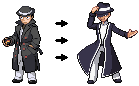
Three of the Elite 4, Audrey, King Vesryn, and a few trainer classes have been slightly altered or completely remade.
4 Likes
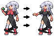
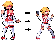
So you made volcarona look like it has electric currents through it, you made maple a girl, and you made Gail a little more boring in terms of pose and little details?
Don’t get me wrong. The sprites are clean, they look nice, and for the most part they look official. But you missed the point with the more important sprites/ npcs that I see you changed. And I know it’s artistic preference (because i didn’t sprite any of these trainers myself), but I still think there are details you just missed overall.
1 Like
Yeah, probably. Gail’s the one I agree with you the most on; looking back, I had difficulty figuring out the nitty-gritty with all the details because the sprite was kinda messy.
Though I’m not really sure how you got “Maple is a girl,” honestly. He’s no more effeminate-looking than any other gen-4-styled male-trainer, which I used in order to get all the details onto the head right.
And you didn’t mention anything specific about Reukra, I’m curious as to what you think.
As for Volcarona,i just think Tron Lines are cool
I mean part of the problem is that I’m inferring body structure based on the lab coat alone which I really should be but even still, maple was meant to be a larger, heavier set professor, not someone with a thin waistline and long legs. The way it’s drawn also makes his chest puff out a bit which makes it appear like the body type overall is more feminine than it may be intended.
Tron lines are alright i guess, just not something I would’ve done in a stylistic preference, that’s all.
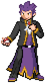
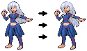
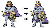
Reukra is… well, different. Blonde instead of black, a coat that isn’t quite the same color, the loss of that bug eyed stare that was intended for him, and once again a character that seemed to shed almost 50 pounds from his body. I mean yes, i appreciate the fact that the sprite is more custom and not the veteran sprite with small changes, absolutely. But If you’re gonna change it, stay faithful to what the character was intended to be.
1 Like
Oh, so they were intended to be more heavyset, stockier characters? I see.
Since both their sprites were, essentially, edits of basic trainer sprites and there’s no official art of them (as far as I’m aware), I couldn’t tell if their proportions/body type were intentional or just leftovers from the base sprite.
I’ll keep that in mind when I work on the next version, and maybe repackage the first one as the BISHOUNEN EDITION or something like that.
I mean, that’s how I believe them to be. Echo could say that I’m entirely wrong but i digress.
1 Like
The Graphics Pack’s been updated to version 1.1 out of I Don’t Know.
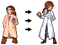
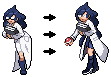
Persephone’s altered sprite was inspired by people grumbling about how tastelessly hypersexualized Persephone’s original 1.2 sprite is. Professor Sylvan was remade because the pose looked very contorted to my eye.
Version 1.2 is now live.
Remade three out of the four Elite Four’s (Eduard, Kayla, and London) trainer, overworld, and mugshot sprites, updated Audrey’s trainer sprite and King Vesryn’s trainer and overworld sprite, and replaced a few generic trainer classes with something more unique while I was at it.
I’ll list things I want to note for the character designs as I go down:
-
Add the red tufts back to persephone. (not the boobs that you took off, I mean the tufts like darkrai has on his collar that nico removed. Thank you though for removing her boobs because i personally hate that nico added those).
-
Eduard is supposed to be ridiculously tall, that was intentional.
-
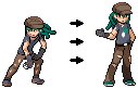
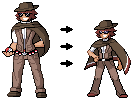
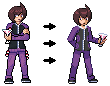
who the hell is Trainer052? I know he’s the dragon tamer trainer but that one is certainly the one that looks the less cleaned up out of the entire pack.
-
London is… meh, looks kinda boring overall to be honest and I’m not entirely sure why. Not really helpful for you and I’m sorry, but just a comment I had.
-
Sylvan looks good, I prefer this one more to be honest, nice job.
-
Kayla was meant to look disinterested, that’s why she’s on her phone. Not really meant for an action pose based on her character.
Hope these help!
1 Like
With the Kayla one, Even though I understand your intention was a selfie, it looks more like her taking a video of the fight to me, while still having a “battle” stance (battle in terms of pokemon standards)
I figured out 52 was the dragon tamer but I dont know, I guess in comparison to the other edits you made there seems to be a lot wrong with this edit. Like the hair seems weird and as if it’s missing pixels, the face is SUPER elongated and makes his face look wide af, the skirt/waist thing makes absolutely 0 sense in terms of how it sits on the body (mostly because you’re darkest purple blends too much with his gray pants and makes the line blurry between them)
Looking back to the Dragon Tamer, I noticed that some of the pixels outlining his face blended in with the collar of his coat, and I also adjusted the shading on his face (alongside addressing all your criticisms).
Does this look better?