EDIT: Since the developers fixed the problem of confusing UI in Update 1.2.5, there’s no need for this mod anymore. Feel free to use it anyway, if you happen to like this look!
Hi everyone!
This is my first post on the forums, and it’s an honor to join this community. From all I’ve seen on the forums, you guys have some great talents!
Pokemon Insurgence is really well-made and beautiful to look at in general, but there is one thing that’s always kinda bugged me. Maybe it’s because I’m a crotchety old 22-year old, but I have trouble seeing what I’m doing on the battle move and Pokemon selection screens. The difference between “selected” and “unselected” is so subtle to me that I’ve sometimes used the wrong move or sent in the wrong Pokemon in battle (and gotten my face handed to me for my mistake!).
So, I decided to brighten the buttons!
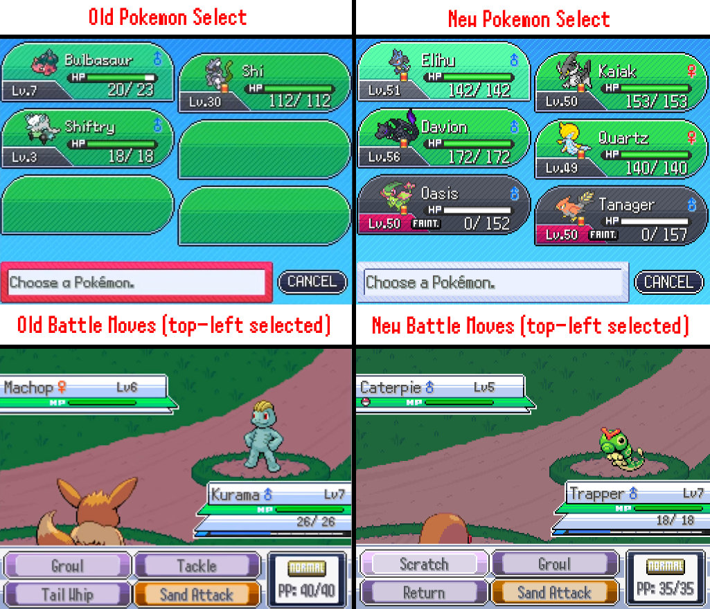
I raised the brightness of the “fainted,” “swap,” and regular selectors on the Pokemon selection screen, and I made the “selected move” buttons higher contrast and brighter (see above).
I hope this mod is helpful to you! All the installation instructions are in the ReadMe, which is included along with the .png files in the .zip file available below:
–== Serv’s Brighter UI – Google Drive ==–
If the mod is useful to you or if you have any questions, feel free to like or reply to this post. I’d love to hear your feedback!
Thanks for stopping by!
– Servant of the King