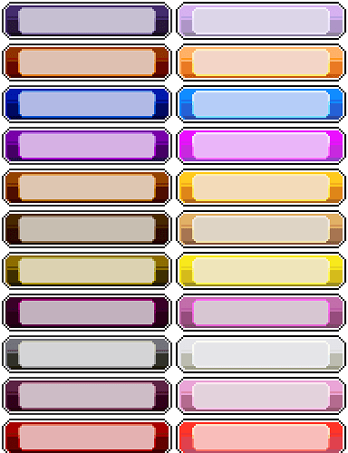
I find it hard to see which move currently is selected in battle and almost impossible to make out which pokemon is selected e.g. when I use healing items.
Selected and unselected buttons would be a lot more easy to distinguish with increased contrast between them.
Here’s screenshots of how that’d look:
Move selection:
Pokemon selection:
I made those by messing with some sprites till I got these:
Graphics/Pictures/partyPanelRectSel.png

Graphics/Pictures/partyPanelRoundSel.png

and Graphics/Pictures/battleFightButtons.png


