Well, I submitted this to the holonuni reddit as soon as the “contest” started, but I didn’t know you could still edit and improve the sprite. I have a few suggestions from there, but I thought it’d be a good idea to get some suggestions for improvements/criticism to try fix it and to perhaps improve my future sprites (if they ever happen.)
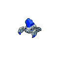
Its a pure rock type!


10 Likes
whats the pokemon type (?) its pretty important i think to write the type since the people seeing it needs to know how much the designfit with the typing
Ah sorry, its just pure rock type
it looks like a rock type but this pokemon looks like a rock fairy type because of the gem or its just me ? idk about pure typing tho i dont like the pure typing because of how small the coverage is and if this pokemon is rock fairy this pokemon will have better coverage and immunity to dragons its just me lol since other than the gem this look like a bug rock type which is dumb so pure rock is better
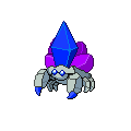
I guess it could be that the paras is pure rock while parasect is rock/fairy. But yknow, I was wondering how to improve the sprites, more than the typing.
the oincer and adding some additions to the gems might be a good idea
Paras looks absolutely perfect.
Parasect is the one that looks awkward with the crystals on its back… but otherwise looks very good.
If you can somehow blend those crystals so they look like they are from the same cluster it would work.
Yeah, I think Parasect would look better if the blue crystal was surrounded by the purple ones rather than in front of them.
Ill give that a go, thanks @Neonivek and berlyda!
Hmmm needs more wheels
I feel it needs some more kush and if it were to be added, I would make its cry Darude - Sandstorm
I’m so sry
can’t be kush its not grass type
ill think about darude tho
Sry, don’t take that seriously, late April Fools joke.
The gems could represent steel typing so it could be rock steel-type